Follow the Palette: Urban Adventures in Full Color

Today we set out on Color-Themed City Walks, inviting you to explore neighborhoods through one vivid hue at a time. By letting color lead your steps, familiar streets feel surprising, stories emerge from façades and signs, and memories gather like swatches in a travel sketchbook. Share your favorite hues, ask questions, and join our walking community for future explorations.

Pick Your Palette and Plan the Route

Start by choosing a single color that sparks curiosity, then map a loop where that shade appears in architecture, signage, flora, art, and markets. Consider safety, accessibility, and rest stops. Build time for lingering in courtyards, narrow alleys, and quiet squares where color clusters unexpectedly. Invite a friend, bring water, and leave space for serendipity.

Murals, Markets, and Everyday Objects

Street art as a guide

Follow mural trails curated by local artists, noting how signatures repeat a signature color. In Mexico City, cobalt motifs can thread through different neighborhoods, while in Melbourne laneways, vivid magentas recur across tags and stencils. Talk to artists when possible, tip respectfully, and document evolution over time. Murals weather, flake, and deepen, teaching patience and attentive seeing.

Markets as color engines

Visit produce markets at opening hour when crates, tarps, and chalkboard signs align into unplanned installations. Red tomatoes beside paprika sacks create stunning gradients; fabric stalls assemble turquoise waves. Vendors know which shipments change the palette each week, and their stories reveal cultural rituals tied to particular dyes, spices, and textiles. Ask permission before photographing close details.

Tiny details that make a walk sing

Look down for curb paint, utility covers, and terrazzo chips glinting your chosen hue. Look up for balcony planters, fluttering laundry, and hanging lanterns. Door knockers, bike frames, and mailbox flags echo larger surfaces. Collect these micro-echoes like notes in a melody; when sequenced later, they transform snapshots into a narrative that feels intentional and deeply personal.

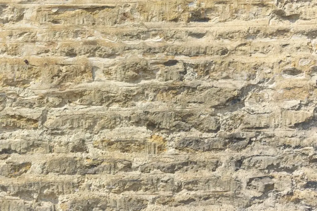
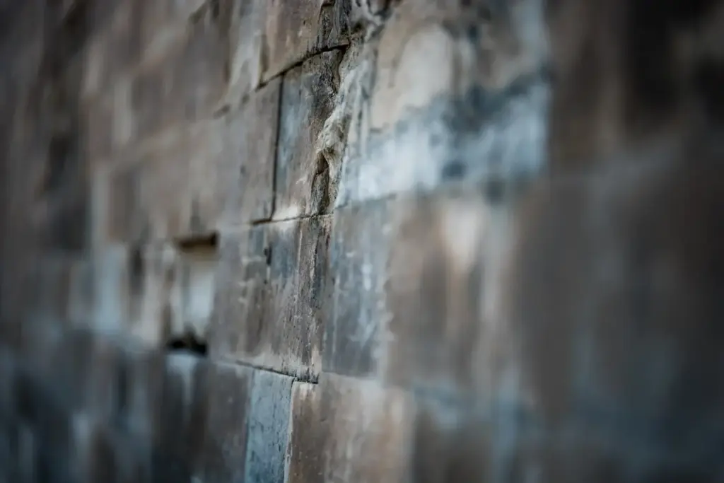
Materials and patina

Trace how painted shutters fade at edges, how copper gutters green with age, and how tiled mosaics keep blues brilliant under salty air. In Lisbon, azulejos stay luminous even on cloudy days; in Marrakesh, red earth pigments soak sunlight into warm velvet. Photograph close to appreciate chips and hairline cracks, since patina turns static surfaces into living archives.

Civic choices that shape color

Cities sometimes regulate façades, preserving palettes that define identity. Jaipur’s pink, Chefchaouen’s indigo washes, and Notting Hill’s pastel terraces are sustained by code, tradition, or community agreements. Research local rules so your walk respects boundaries and avoids private zones. When permitted, ask residents about repaint rituals; their calendars often align with festivals, harvests, or practical weather windows.

Seasonal and Festival Color Shifts

Color pathways are alive, shifting with blossoms, holiday banners, and even construction tarps. Spring may bathe alleys in lilac petals; summer flags saturate plazas; autumn leaves cool fiery facades; winter lights repaint steel and stone. Track predictable cycles and fleeting moments alike, building a calendar that guides future strolls, workshops, and meetups timed to peak chromatic moments.

Spring blossoms and repainting cycles

Cherry and jacaranda blooms temporarily drape streets in pinks and purples that align perfectly with pastel stucco. Municipal repaint crews often refresh benches and railings after winter, creating crisp accents for your chosen color. Ask gardeners about pruning schedules, and check community boards for neighborhood cleanup days, where fresh coats appear overnight, reshaping routes you walked only yesterday.

Summer brightness and glare management

Harsh sun can flatten saturated surfaces. Use polarized sunglasses to preview reflections, and position yourself at oblique angles to recover texture. Golden hour returns gradients to glossy tiles and enamel signage. Bring a hat to reduce squinting, and hydrate more than usual. Heat shimmers may create painterly effects in distant façades, perfect for abstract frames that still honor your hue.

Autumn hush and winter glow

As leaves turn, brick and terracotta harmonize with burnt oranges, while winter introduces metallic and electric highlights from seasonal lights. Snow, frost, or rain-deepened pavements create luminous backdrops that heighten blues and greens. Embrace slower pacing, warmer layers, and thermos breaks. Document how the same storefront reads utterly differently in January versus May, teaching respect for cyclical transformation.

Photographing a Cohesive Color Story

Treat the walk like a sequence, not isolated snapshots. Begin with establishing shots, move into textured close-ups, and finish with reflective scenes showing people interacting with color. Consistent white balance preserves continuity. Shoot vertical and horizontal variations. Keep a loose shot list, yet stay flexible for surprises, because spontaneous moments often deliver the emotional anchor your gallery needs.

01

Phone settings that truly help

Lock exposure on mid-tones to avoid blown highlights, and set white balance manually when possible. Use grid lines to keep façades straight, and burst mode for flags or laundry in motion. Consider RAW capture for nuanced edits later. Clean your lens frequently; city dust dulls color fidelity. A simple wrist strap prevents mishaps during crowded market discoveries.

02

Compose with rhythm and repetition

Seek patterns of your chosen hue across different scales: a door, a scooter, a scarf, a billboard. Arrange frames to alternate tight, medium, and wide shots, creating visual breathing room. Find leading lines like tram tracks or shadow edges to guide the eye through repeated accents. Sequence images deliberately so viewers feel they walked alongside you, step by step.

03

Edit with restraint and intention

Resist oversaturation. Gentle contrast and careful shadows protect texture and truth. Crop distractions that dilute your chosen hue’s impact, but keep contextual clues like cobblestones or street numbers. Write captions that credit makers and residents. End with a simple call to action: invite viewers to suggest the next color, subscribe for route maps, and share their own galleries.

Walking Together: Community, Safety, and Sharing

Color-led exploration is richer with companions. Group walks build confidence, uncover local knowledge, and create layered perspectives on the same hue. Set inclusive guidelines, pace for all abilities, and include quiet stops for sensory breaks. Share maps, accessibility notes, and restroom markers. Celebrate respectful conduct: ask before photographing people, protect private spaces, and leave every surface untouched.
Vefitakakilepulanovi
Privacy Overview

This website uses cookies so that we can provide you with the best user experience possible. Cookie information is stored in your browser and performs functions such as recognising you when you return to our website and helping our team to understand which sections of the website you find most interesting and useful.